Build a Responsive Website in Webflow
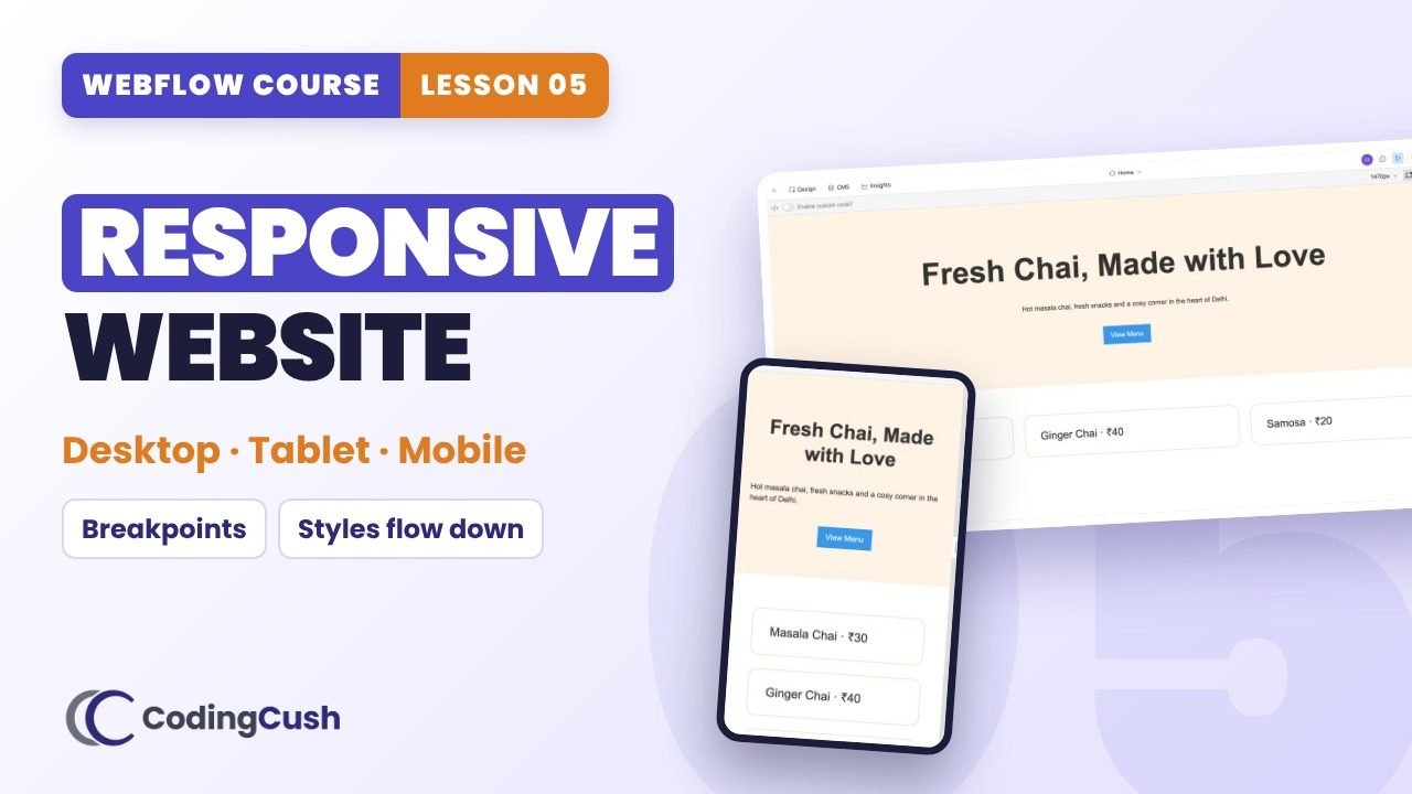
Breakpoints, how styles flow down, orange vs blue labels, and the exact fixes for tablet, mobile landscape and mobile portrait.
💡Key ideas
Breakpoints, how styles flow down, orange vs blue labels, and the exact fixes for tablet, mobile landscape and mobile portrait.
Responsive = fits every screen
A responsive website changes its layout to fit the screen: laptop, tablet, phone.
Styles flow down
Anything you set on desktop also applies to tablet and mobile. A change on a smaller breakpoint affects only that breakpoint and the ones below.
Orange vs blue labels
Orange: the value comes from a larger breakpoint. Blue: the value is set right here.
Design desktop first
Desktop is the base. Then fix tablet, then mobile. Check every breakpoint before you publish.
⏱️Chapters
Click a chapter to jump to that moment in the video.
📋Step-by-step
Tick each step as you build it in your own site. Your ticks are saved.
Tablet
Mobile landscape
Mobile portrait
⚙️Webflow breakpoints
| Breakpoint | Width | Note |
|---|---|---|
| Desktop (base) | 992px and up | Styles here flow down to all smaller screens |
| Tablet | 991px and below | First place to fix big headings |
| Mobile landscape | 767px and below | Grids usually become 1 column here |
| Mobile portrait | 479px and below | Smaller fonts, less padding |
/* desktop (base) */
.hero-heading { font-size: 64px; }

@media (max-width: 991px) {   /* tablet and below */
  .hero-heading { font-size: 52px; line-height: 62px; }
}
@media (max-width: 767px) {   /* mobile landscape and below */
  .menu-grid { grid-template-columns: 1fr; }
}
@media (max-width: 479px) {   /* mobile portrait */
  .hero-heading { font-size: 36px; line-height: 44px; }
  .hero { padding: 56px 20px; }
}⚠️Common mistakes
🧠Recap & quiz
First the recap question from the video, then the quiz. Your best score is saved.
Recap: In the Style panel, what does an orange label mean, and a blue label?
Q1 of 4 · You change the font size on the tablet breakpoint. Which screens change?
Q2 of 4 · At which width does Webflow's tablet breakpoint start?
Q3 of 4 · A blue label on a value means…
Q4 of 4 · Best order to design?
🏠Homework
Do this on your own site before the next lesson.


❓FAQ & key terms
Is a Webflow site responsive automatically?
Webflow gives you the tools, but you must check every breakpoint and adjust fonts, padding and columns.
If I change a style on tablet, does desktop change?
No. Changes flow down to smaller screens only.
Should I design mobile first in Webflow?
No. Desktop is the base breakpoint, so design desktop first and then fix smaller screens.
Lesson 05 of 11 · All cheat sheets · Watch on YouTube
Save your progress
Enter your name and email once. We'll remember your ticked steps, quiz scores and completed lessons, so you can continue on any device.
No spam. Only course updates, and you can unsubscribe any time.