

 Lavkush
The Webflow Designer is the visual workspace where you build a Webflow website by placing and styling elements on a live canvas, while Webflow quietly writes the HTML, CSS and JavaScript for you. The screen has three main parts: tools and panels on the left, your page on a canvas in the middle, and style controls on the right. Once you know what each part does, the interface stops looking like a cockpit and starts feeling like a tidy workbench. This tour covers every main area, then finishes with a small first task.
What the Designer Is, in Plain Words
Most website builders hide the code completely and give you fixed blocks to rearrange. Webflow is different: the Designer is a visual way of writing real code. Place a heading on the canvas and Webflow creates a genuine heading element. Change its size or colour and Webflow writes the matching CSS. You design and code at the same time, without typing the code yourself.
The result behaves like a hand-built website: responsive and exportable on certain plans. The trade-off is a small learning curve, since you learn real web ideas, such as structure, classes and the box model, visually. New to this? Follow our guide on how to build a website in Webflow alongside this tour.
The Left Side: Toolbar and Add Panel
Down the left edge sits a slim toolbar of icons, your route between the main areas: the Add panel, Pages, the CMS, Assets and form settings. New users live mostly in the Add panel, marked with a plus sign.
Open it and you will find the building blocks of a page. At the top are structure elements such as Section, Container and Div Block, which hold other content. Below are basic elements: headings, paragraphs, buttons, links, images and lists. Further down sit components like navbars and forms, ready-made groups of elements. You add something by dragging it onto the canvas, or clicking it to drop it into the selected position. The golden rule: structure first, content second, styling third. Your future self will thank you.
The Navigator, the Canvas and the Breakpoints Bar
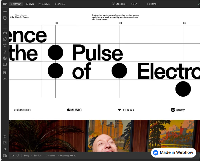
The Navigator is a tree view of everything on your page, showing which elements sit inside which: a section contains a container, the container holds a heading and a paragraph, like boxes inside boxes. Use it when the canvas gets confusing or something will not select.
The canvas in the middle is your page itself, live and editable: click text and type directly, drag elements to reorder them, and see changes instantly. Above it runs the breakpoints bar, with device icons for desktop, tablet, mobile landscape and mobile portrait. Click one and the canvas resizes. Styles cascade downwards from desktop, so design desktop first, then tidy smaller sizes. Webflow University covers these fundamentals in its free Webflow 101 course.
The Right Side: The Style Panel
Select any element and the right-hand panel wakes up: the Style panel, where visual decisions happen. At the top is the element's class, explained shortly. Below, sections control layout, spacing, size, typography, backgrounds and borders, using number fields, colour pickers and toggles.
Two habits will save you hours. First, change one thing at a time and watch the canvas, so you learn which control did what. Second, use margin and padding rather than empty elements to push things apart. Empty spacers are the web design equivalent of stuffing paper under a wobbly table leg: it works until it does not.
Tabs on the right also switch you to element settings, such as a link's destination or an image's alt text, and to interactions, where animations live. Leave interactions alone on day one: a calm, working page beats one that spins heroically and says nothing.
Pages, the CMS and the Breadcrumb Bar
The Pages panel lists every page of your site and lets you create or duplicate pages and adjust settings such as the name and URL slug. The CMS panel manages collections, Webflow's content system for blog posts, team members or products: design one template and the CMS fills it with each item's content. Our Webflow beginner roadmap sets out a sensible order for learning all of this.
At the bottom of the canvas sits the breadcrumb bar. It shows the chain of parents for the selected element, for example Section, then Container, then Heading, and clicking a name selects that parent. It solves a common frustration: clicking a container completely covered by its contents.
| Designer area | Where it is | What it is for |
|---|---|---|
| Add panel | Left toolbar | Adding sections, headings, buttons, images |
| Navigator | Left panel | Seeing and selecting page structure |
| Canvas | Centre | Editing the live page directly |
| Breakpoints bar | Top of canvas | Designing for tablet and mobile |
| Style panel | Right | Layout, spacing, text and colour |
| Pages panel | Left panel | Managing pages and settings |
| CMS panel | Left panel | Managing collections like blog posts |
| Breadcrumb bar | Bottom of canvas | Selecting parent elements |
The Box Model, the Webflow Way
Every element on your page is a box, and boxes sit inside other boxes. Each box has its content, padding inside that pushes content from the edges, a border, and margin outside that pushes neighbours away. In the Style panel, Webflow draws this as a small diagram you can click and drag, far friendlier than memorising numbers.
Here is that idea as hand-written code:
<div class="hero-box">
  <h1>Welcome</h1>
</div>
.hero-box {
padding: 40px;
margin: 20px;
}In Webflow, you never typed that: you dragged the padding to 40 pixels and the margin to 20. Same result, kinder process. Browse Webflow University's wider course library for video lessons on layout.
How Classes Work
A class is a saved bundle of style settings with a name you choose, such as Main Heading or Primary Button. Apply it and the element receives those settings at once. Editing the class updates every element using it: change your button colour in one place and every button follows, which feels like magic when it saves you twenty edits.
Name classes after their job, not their appearance. Big Blue Button is a trap: one day the button will be teal and small, and the name will lie forever. Primary Button stays honest. The class appears at the top of the Style panel; if none is set, create one before styling, otherwise your styles apply to every element of that type.
Preview Versus Publish
The eye icon near the top switches on preview mode, showing the page as a visitor would see it, with working links and no editing outlines. Preview is private and never changes your live website.
Publishing is the real thing. The Publish button sends your design to your staging address, ending in webflow.io, and, if your plan allows, to your custom domain. A sensible routine: preview first, check each breakpoint, publish to staging and click through it like a visitor, then publish to your domain. Thirty seconds of checking beats an apologetic message to a client.
Your First Small Task: A Simple Hero Section
Let us put the tour to work. Open a blank page. From the Add panel, drag in a Section, then a Container inside it. Add a Heading with a welcome message, a Paragraph underneath with one friendly sentence, and a Button below it with inviting text such as Get Started. You have now used structure, content and the canvas: most of daily Webflow life already.
Next, select the heading, give it a class called Hero Heading, and increase its size and centre it in the Style panel. Give the section a class called Hero Section and generous top and bottom padding. Give the button a class called Primary Button, a background colour and rounded corners. Finally, check the tablet and mobile breakpoints, shrink the heading if it looks crowded, and preview. Real structure, real styles, no code typed.
Frequently Asked Questions
Is the Webflow Designer the same as the Webflow dashboard?
No. The dashboard manages sites at account level. The Designer is the editing workspace inside one site, where you build and style pages.
Do I need to know HTML and CSS to use the Designer?
No, but a little helps a lot. CSS often finally makes sense when you can see it changing a live page.
What is the Navigator for?
It shows your page structure as a tree. Use it to select hard-to-click elements and rearrange things.
Does previewing a page change my live website?
No. Preview is private. Your website only changes when you publish, to staging first and then to your domain if you choose.
Conclusion
The Webflow Designer is three ideas in one interface: add structure and content from the left, edit the live page in the centre, and style it from the right. Learn the box model and classes early, and preview before you publish. One hero section from now, the cockpit will feel like a workbench.


Leave a Comment